Glints Marketplace Information Architecture

How might we create a improve the information architecture of Glints Marketplace so that users can easily find their way through different Glints' products?

My Role
  • Recruited users for interviews Facilitated card sorting activities with multiple product teams
    Built tree testing survey
    Designed final sitemap
Team
  • Nurul Ibrahim (Design Lead)
  • Hazel Teng (Product Manager)
  • Indriani Jasmine (Product Analyst)
Results
  • Improved and simplified the website navigation across all Glints products

The Challenge

As the number of Glints products expanded, finding space on the menu became a significant challenge. Each product team had different ideas on where to place new features in the navigation. We sought to find a more effective method for determining how to add new items to the navigation and evaluating if our current structure meets the needs of our users.

Discovery and Research

To start the redesign, we first tested out the current infrastructure and looked for the issues with our users and stakeholders.

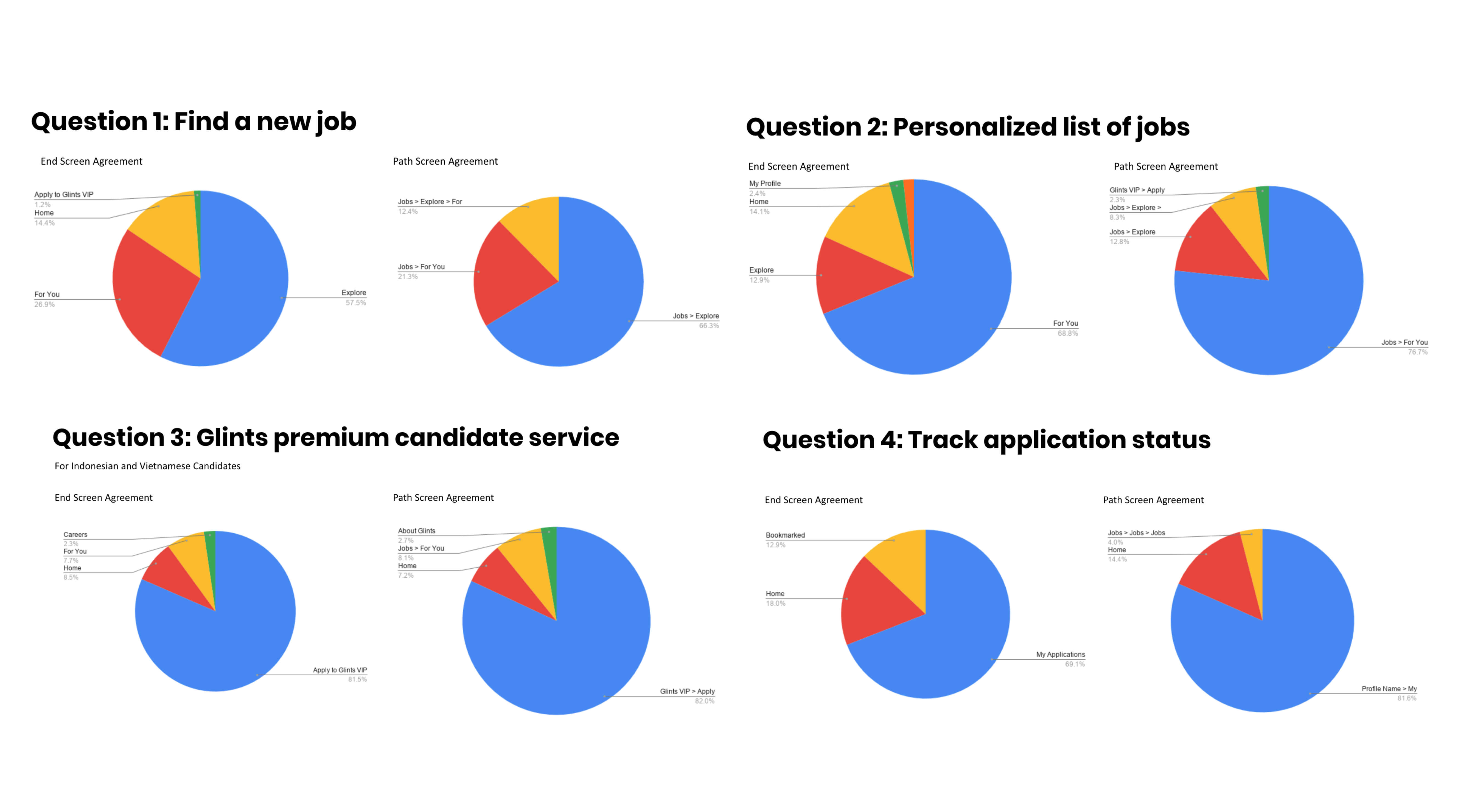
We conducted an External Tree Test with 225 users and Card Sorting Excercise with 5 external users and 10 stakeholders and looked for the holes where our users and stakeholders would normally get stuck in.

Search suggestions appear slow and are not intuitive to user’s needs

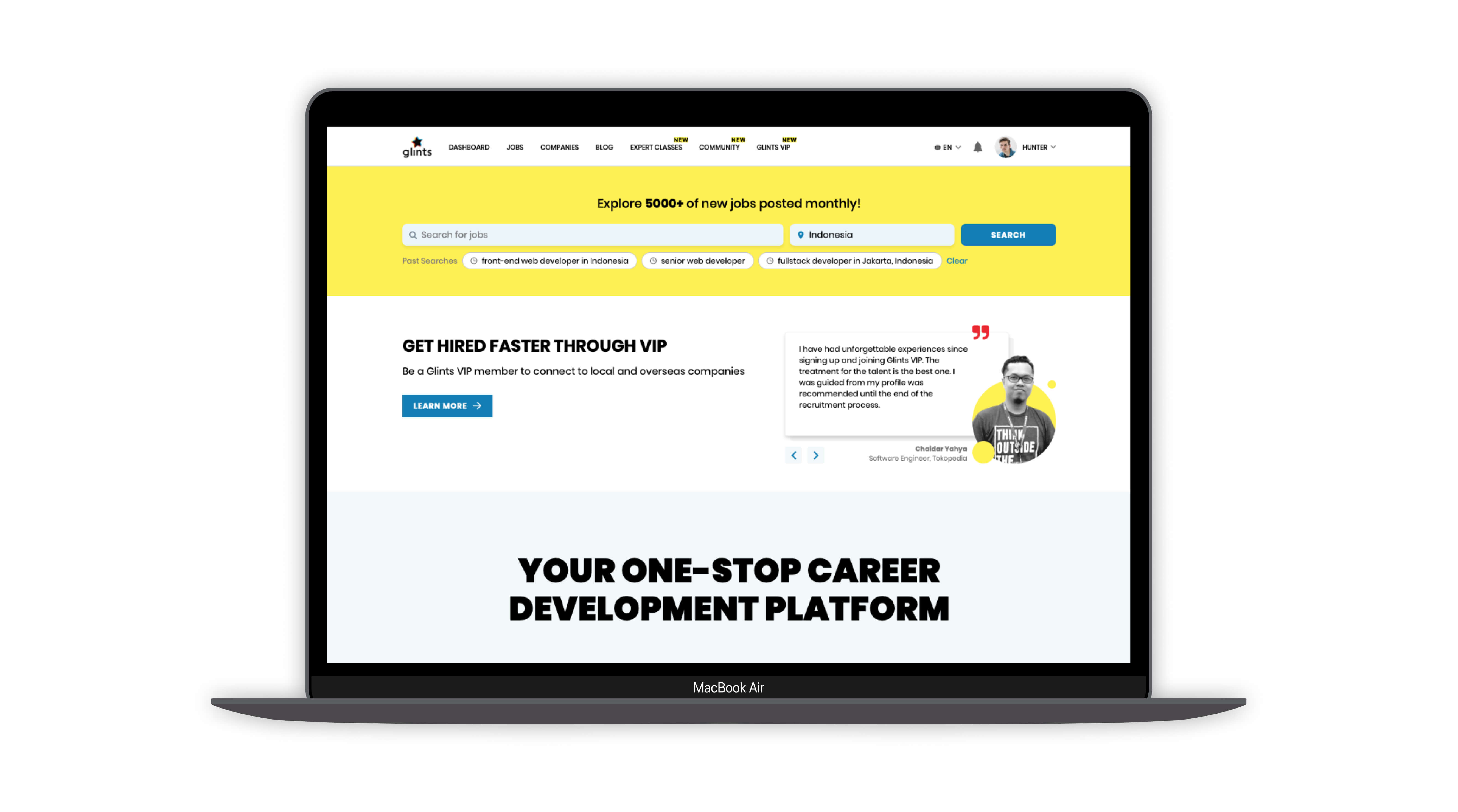
We discovered that when a user types a keyword, the suggestions were rather slow in appearing. This is because we show suggestions under a job title, company and location. We also saw that the list of suggestions that appear are unrelated to the keyword that the user typed. For example if the user types "J”, other words without the letter ‘J’ also appear in the suggestion list.

Work Image
External Tree Test
Participants

Quantitative, unmoderated testing

Participants

225 active users which have used all Glints products at least once from Indonesia, Vietnam, Singapore and Taiwan

Test Results
A few of the results we got from our External Tree Test
  • High percentage of our users are from Indonesia, and they are very familiar with how to find key user actions on our website
  • But for users from Vietnam, their experience is different from Indonesian users. For example, when asked where to find a job, they answered ‘For You’ instead of ‘Explore’. This means that we need to come up with terms that are familiar to the majority of our users
  • For Glints to be hyperlocal, I recommended to conduct more contextual inquiries into our different clientele to determine socio-cultural complexities and commonalities.
Stakeholder Card Sorting
Participants

Qualitative, moderated testing

Participants

5 Glints users, 10 stakeholders from each Glints product team

Test Results
An example of our card sorting activity with stakeholders
Organizing by Activity
  1. This is very similar to how Linked In classifies their services.
  2. Under each page, we can provide filters for each activity such as Jobs, Community and Events.
  3. We can add more touchpoints in different product pages which lead to more website engagement.
Organizing by Activity
  1. Users are already familiar with our products and changing the structure might lead to confusion and frustration.
Initial Sitemap

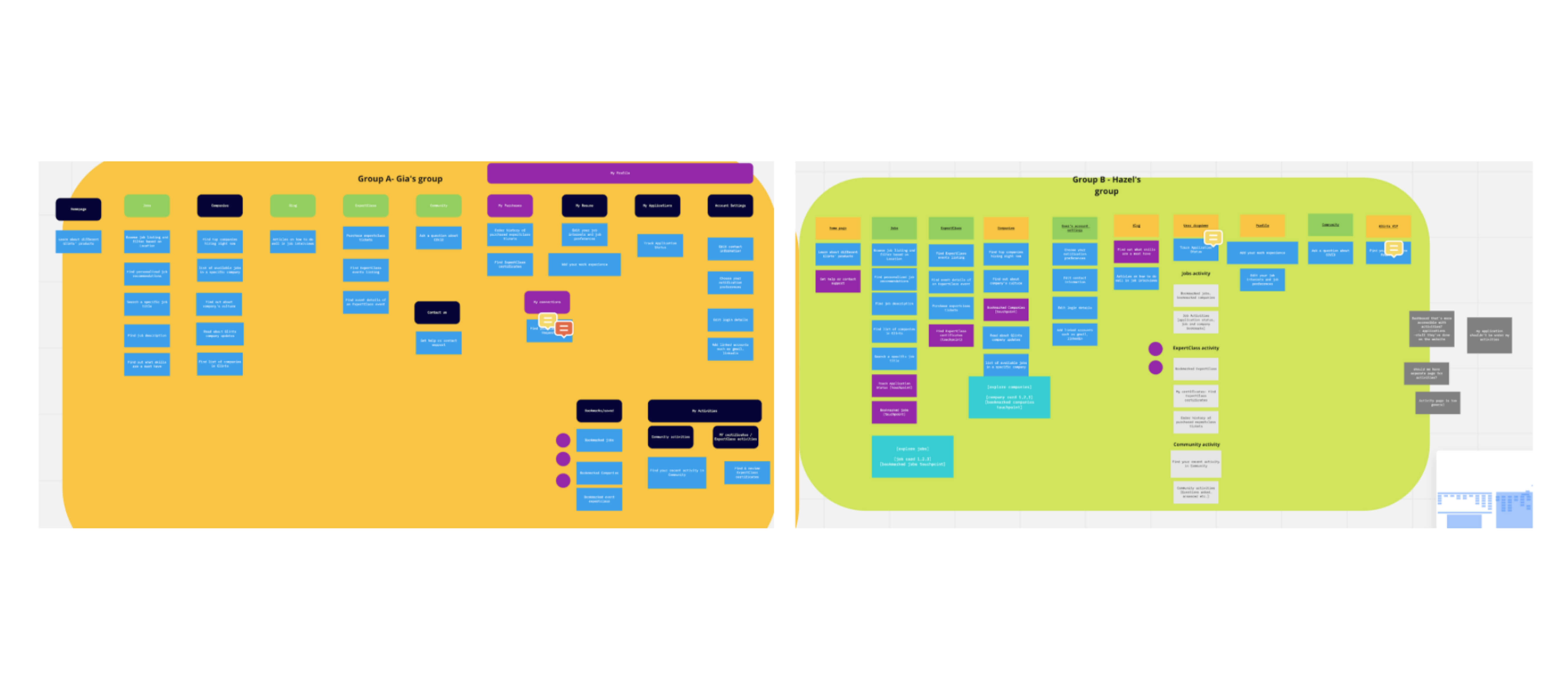
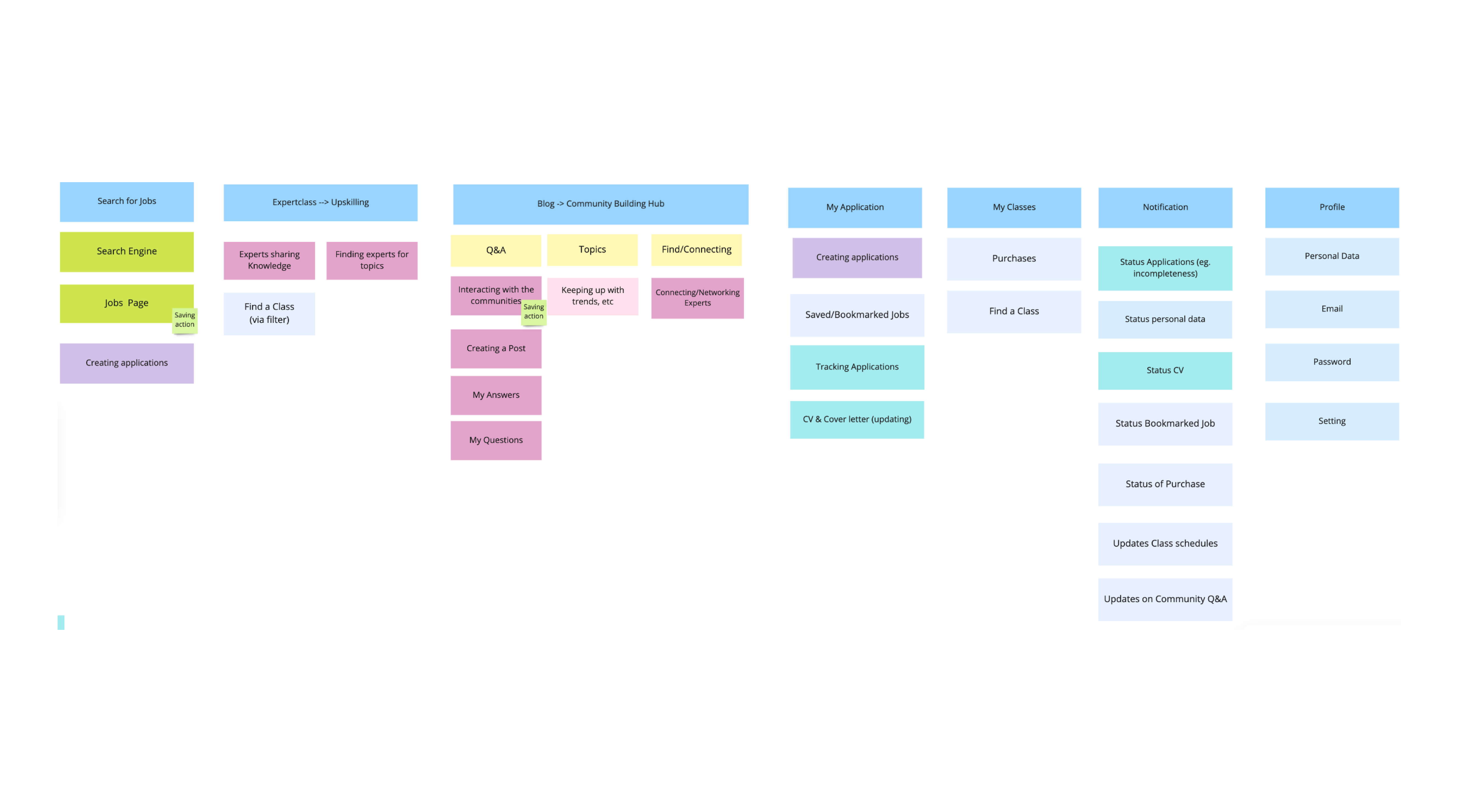
After the Stakeholder Card Sort, we validated whether it was better to organize by activity or by product through an external card sort. This results were compiled into a sitemap for better visualization:

  • Users are already familiar with our top categories
  • As long as we keep our labels short, users can easily recall this
  • Users need to know more about the company as well to make a better decision about applying to a job.
  • In the Applications page, users expected to see some tips on applying for a job or how they can be more prepared for the job interview
  • For the cards colored in white like bookmarked jobs or bookmarked company, the participants are also divided on whether to place it under the jobs or under the profile in My Applications. This would need further validation.

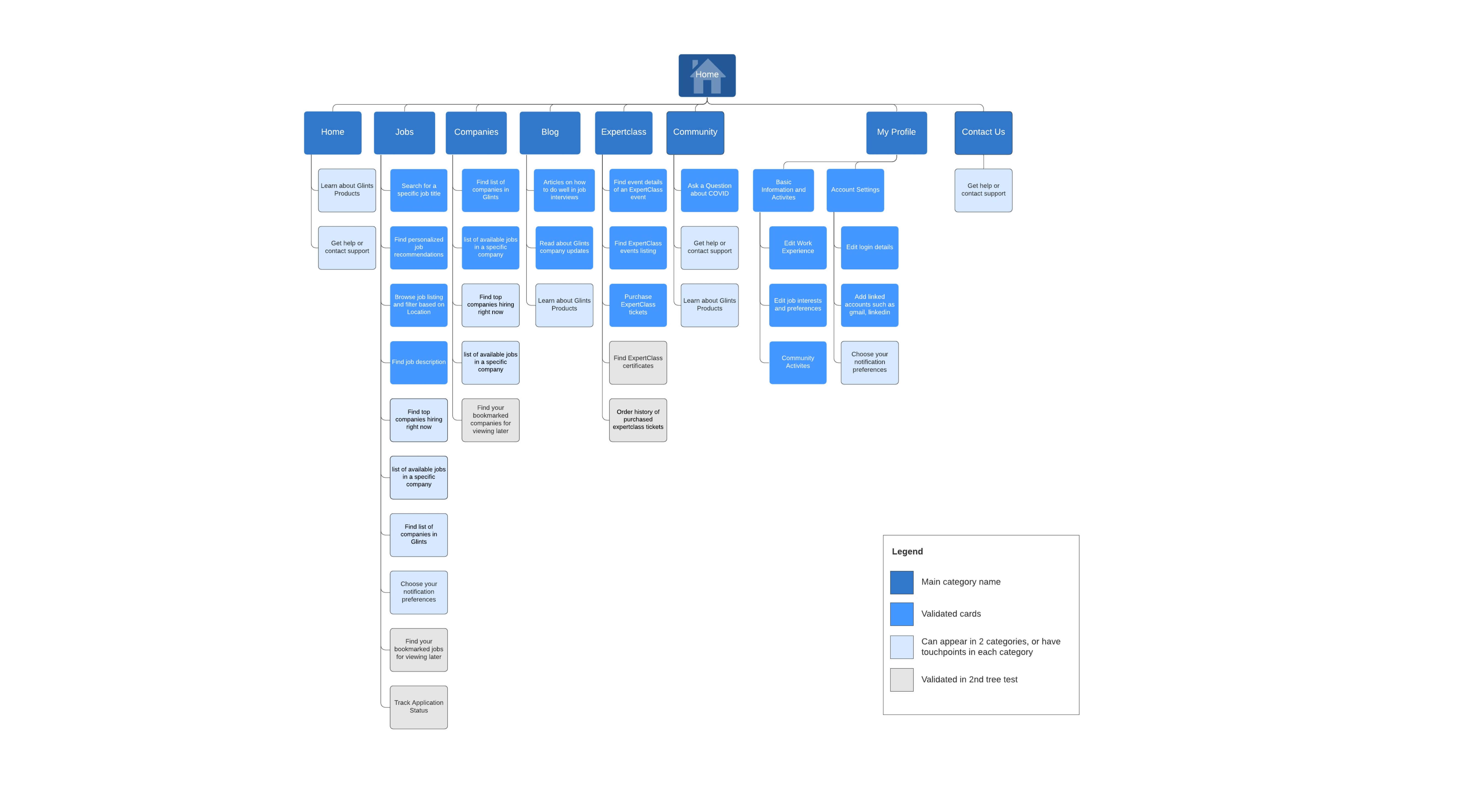
We further validated the questions we had on the initial sitemap through another round of external tree testing and card sorting with stakeholders. Through the final card sort, we were able to finalize and develop a solution that would benefit both the user and our stakeholders, as visualized in the sitemap below.

Our final sitemap was a combination of organizing by activity and by product. Familiar products retained their names, but under each product we specified which activity would belong to a specific product. This helped us create a method for more easily deciding where to place new products and for organizing Glints products in the long run.

Conclusion

We also added marginal improvements to our job listing page:

  • Add links to company pages from the job details pages
  • Add blog excerpts or tips in the job pages relating to the job application process and how users can be more prepared